
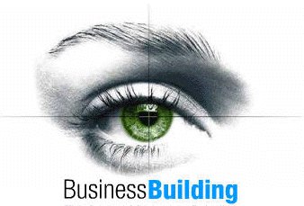
The Logo Design or Product Logo Design is the most important element for every brand, company, service or product.
That is why you may invest some extra attention and money on the logo, either your current ones or the upcoming ones.
Here there are 9 golden rules which have to be considered in every Logo Design:
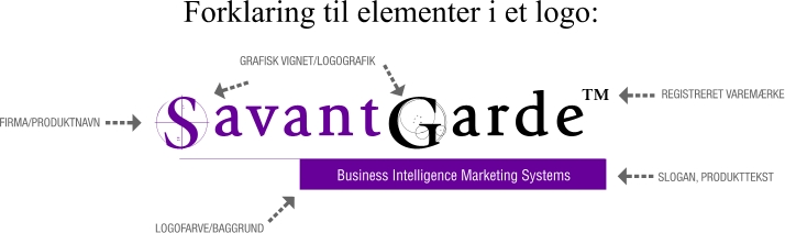
- The Logo Word and the length of that word or words
- The Logo Typography
- The Logo Design Rules
- The Logo Graphics, Drawings or Symbols
- The Logo and Company Colours
- The Logo Slogan
- The Logo Trademark (almost all serious logos are registered trademarks) Always make your company name and products to an (R) or TM registered trademark or word trademark.
- The way the Web Design is working with and is presenting the logo and brands
- Integration in QR CODES for optimal service for the hand-held users (65%)
- Integration to 3D Design, Videos and most know ADOBE products.
- Legal Protection of the name rights, investigations of former company names, the sold rights for that and the current domain names. Remember all non-registrated brands.
Some of the most impressive logos in the world are actually very simple. Simplicity is the key when you want an easy to remember logo. When it comes to Art Director Logo Design you will have some of the most powerful tools available on this earth. This is what it is about:
- The possibility of having your own font (from +2500 dollars)
- Professionally Typography Library of around 600.000 fonts
- The access for the symbol library with virtual millions of signs and symbols
- The experience of the 25 years of experience with the creation of Corporate ID
- Based on recent past 300 studies from Psychology, Biology, Sociology, Graphic Design for Corporate ID, Brand Building and Logo Design
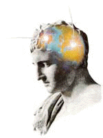
Innovative Logo Design is designed directly for the products to the audience
When the designer is working with the logo, he or she is carefully studying your products or service and the intended audience for those. When you are making really good logos, you will also implement more psychology-based design rules, which is intended to make an impression on the viewer’s feelings and thoughts. If you can do that, then you actually gain access to this person’s memory.
The human mind is designed to remember thousands faces and symbols. That ability is genetically heritage through millions of years. That is why you will always try to design a logo which describes the company and the logo reflects the purpose of the design rules. Usually, you will not work with more than one colour. It is a bad idea to have multiple colours unless they fulfil a purpose in the design manual. Of course, every logo is delivered both in several bitmaps and vector formats, so your logo can be reproduced and scaled from a mini badge to 100×100 meters on print if needed.
Typography with special typefaces is the key to be remembered
But the key to the high recognition of a logo is the font and the form. The colour is secondary because the human mind is designed to recognised shapes and forms, and even so there is millions of colours, the recognition of a symbol or a font type is the key. Trademarks work MUCH better Consider paying around € 250 for the registration as a REGISTERED TRADEMARK.
That is the (R) and TM you put right after your logo, in the upper right corner. If you own a Registered Trademark, then you do have much higher customer trust and it also protects your design or company name as an Intellectual Property. Here I will go through 5 customer cases where you actually can see what I did as suggestions and what it turned out to be. Normally I do around 20 suggestions for a new logo – why is that? Most companies and especially the owners do have expectations, which I often have to meet, and by doing 20 suggestions it is not a question if they are using my single logo or another agency. It is simply a choice from which of my logos they are going to choose.
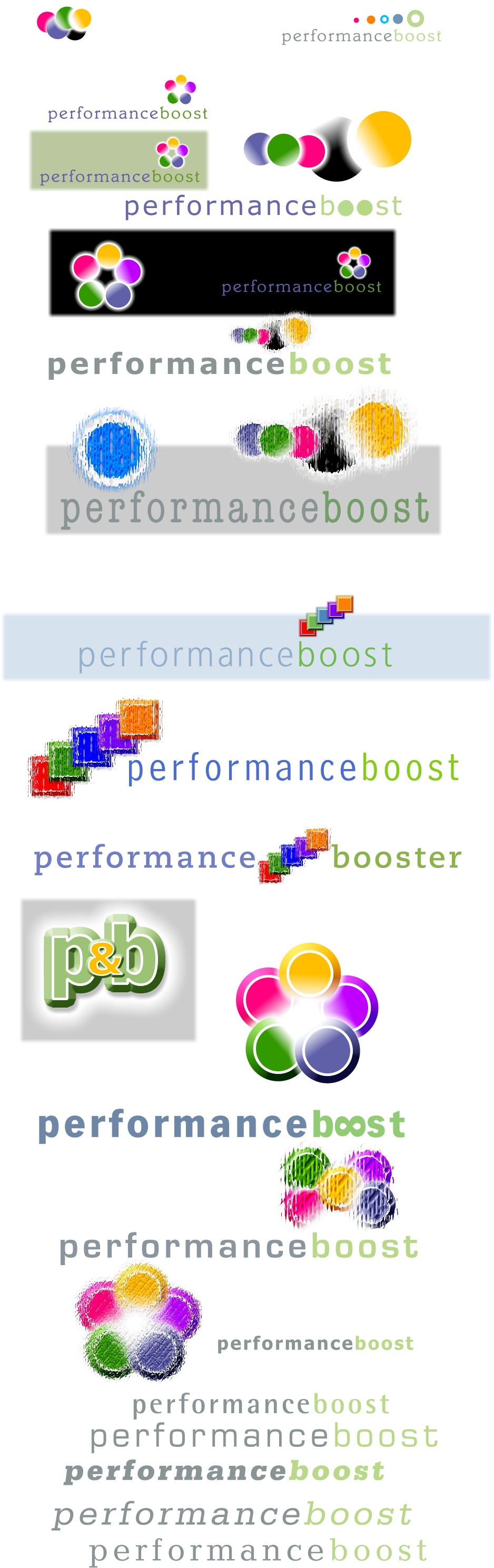
Here are some of my work:


Why not have your own typeface, which can be used on the net also
Since we are designing some fonts directly I can also assure the company, that they can buy their own unique font type which often is the case, if the customer has more than 50 employees. The investment in your own font is a good idea, and it will have a very long life cycle, and often the cost will be under €100 per. year depending on how many years you are using the typeface.
See our TYPEFACE DESIGN
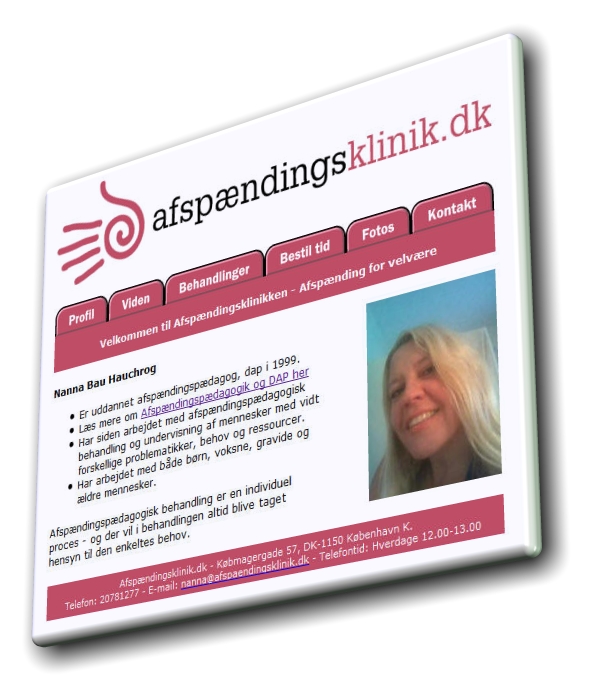
Logo Design Corporate ID
Here are some samples of my work during the time, I did not update for many years, for a complete list (around 2.500 Logo, Graphics and Products), make an account for the login…
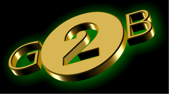
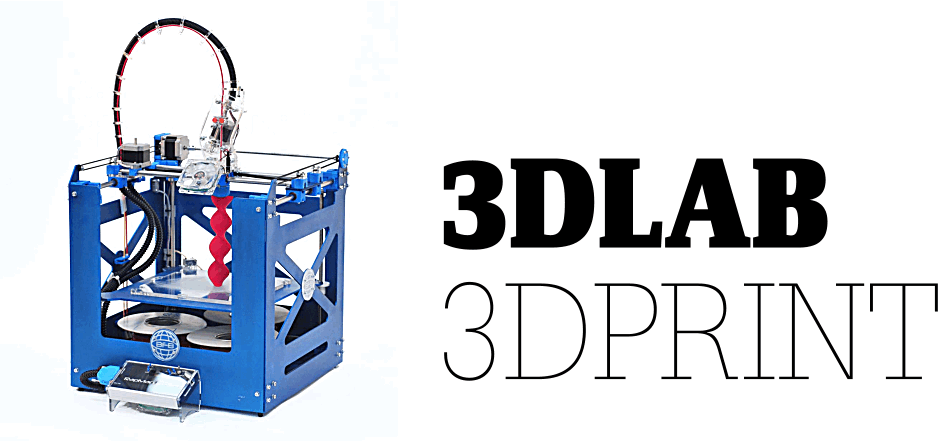
3D VIDEO Logo for GET2BUSINESS
BANNERS FOR FONTDESIGN AND ICON DESIGN:
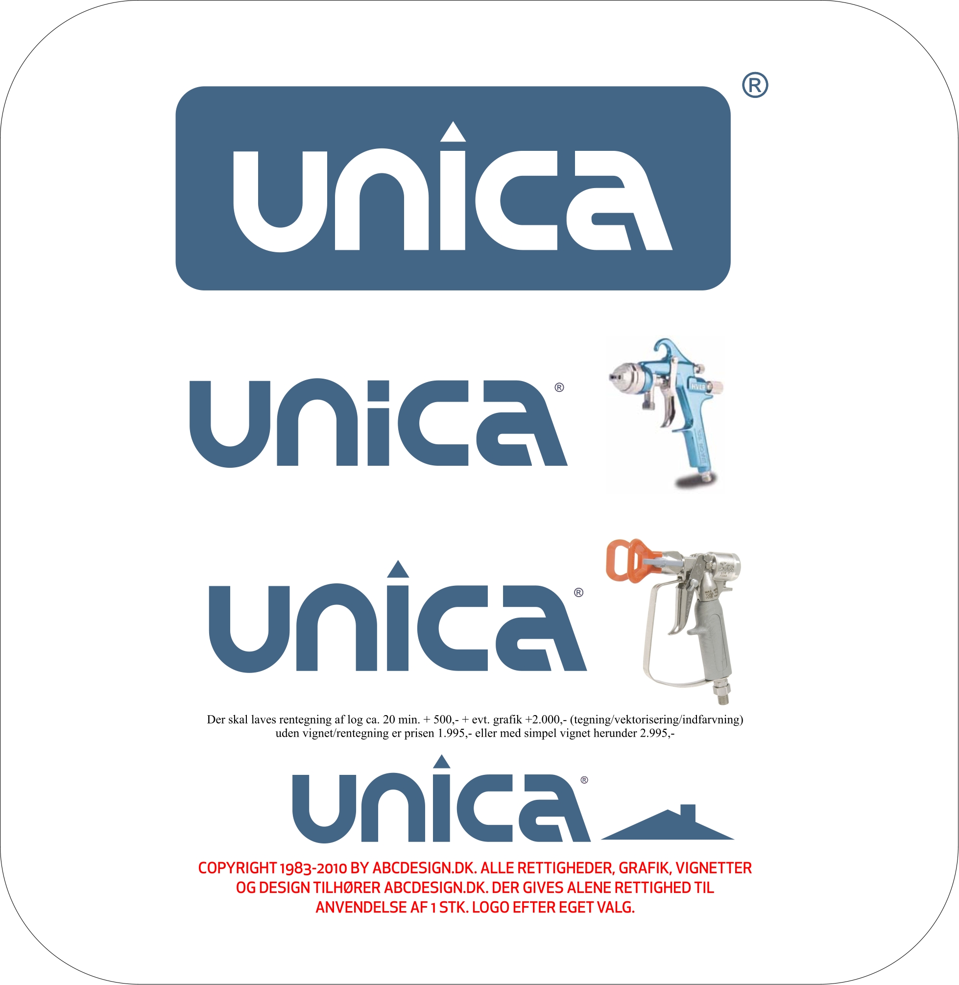
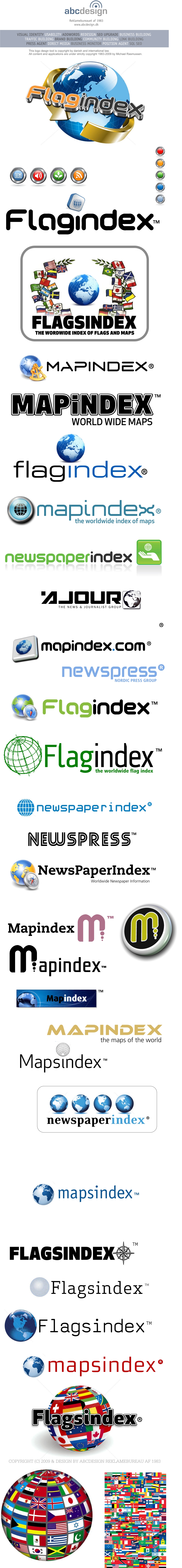
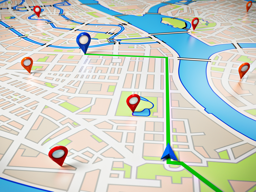
Logo Design for Mapindex
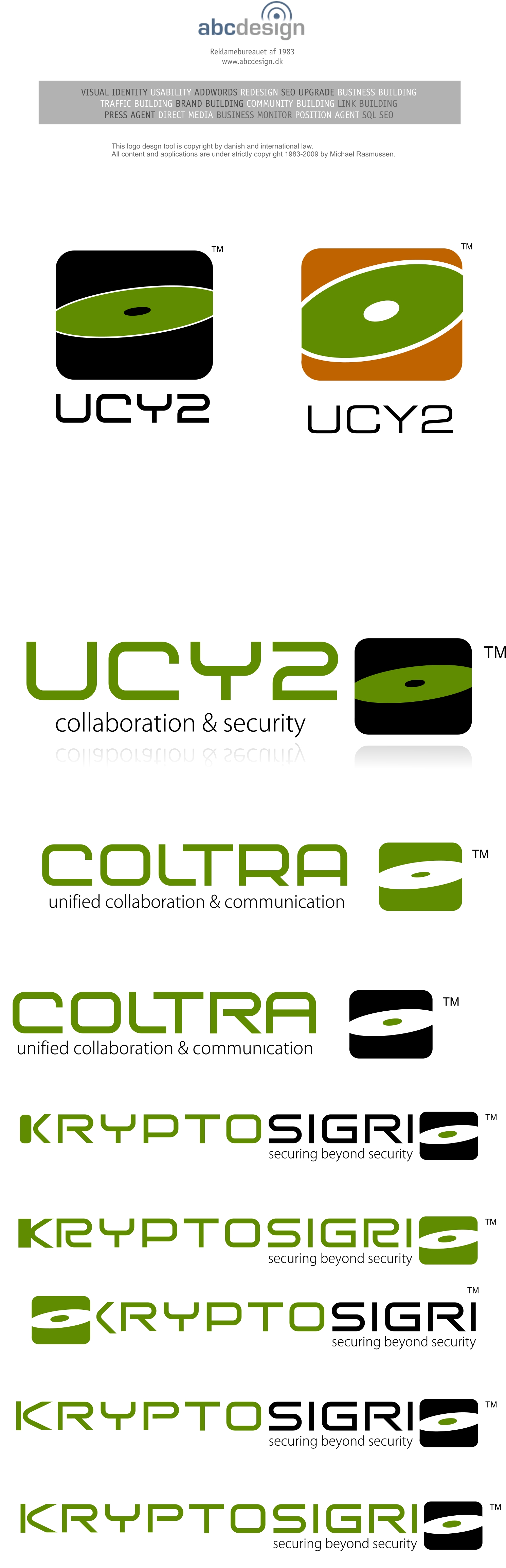
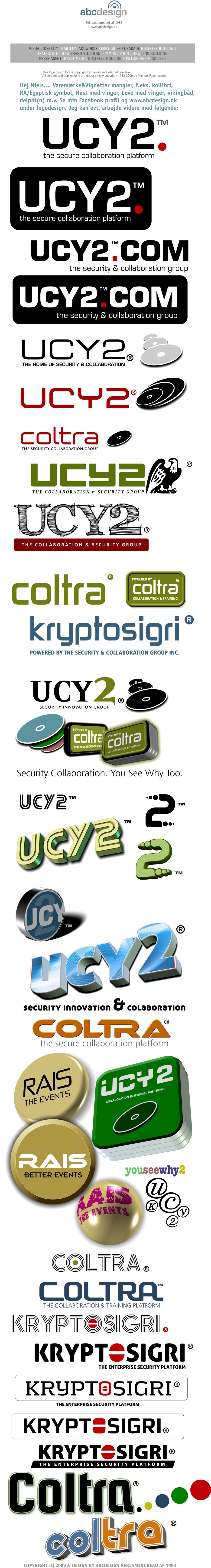
LogoDesign for a CD security firm
Vignet for LogoDesign where the word already was to keep
LogoDesign for a ProjectDevelopment company
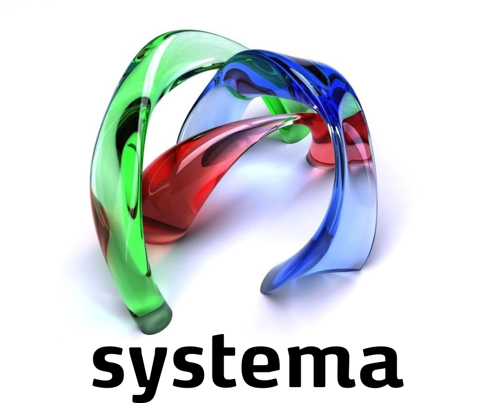
3D Trademark for a e-learning system
Machine Learning & 3D Mapping Service by www.Agiludvikling.dk/Agile. Also used by Copenhagen Municipality to view Airmaps and plans in the municipality in 3D.
Candidate Tracking, ERP & CRM Services based on Machine Learning for the Life Science Industry.
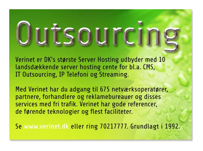
Server Hosting Center App for Verinet(R) Hosting Center

4 in 1 APP Builder Logodesign made by Agiludvikling.dk

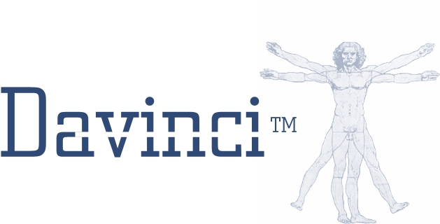
Corporate ID Logo Design for MaxID.

Corporate ID Design for Panoramax 360+ 3D Video
One of the first Font & Logodesigns in Fruebjergvej 3, Year 1992, when we did start the first webdesigns in ABCDESIGN.
Corporate ID and update of the Corporate ID Map on 100 pages
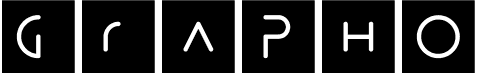
Another LogoDesign, simple but yet powerful for an exhibition.

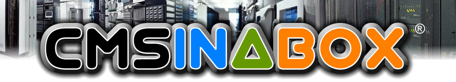
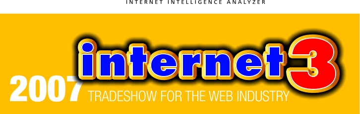
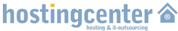
LogoDesign for Server Hosting Center
The Brand Logo for its products, also reverse Logo Design.
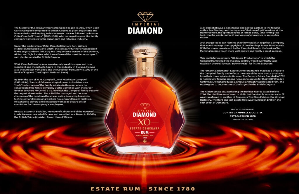
Design and alterations of a bottle with a weight of originally 2,2 KG and logo-design for a new Gin Concept and Gin Bar Concept in Europe and USA.
Exhibition logo & website
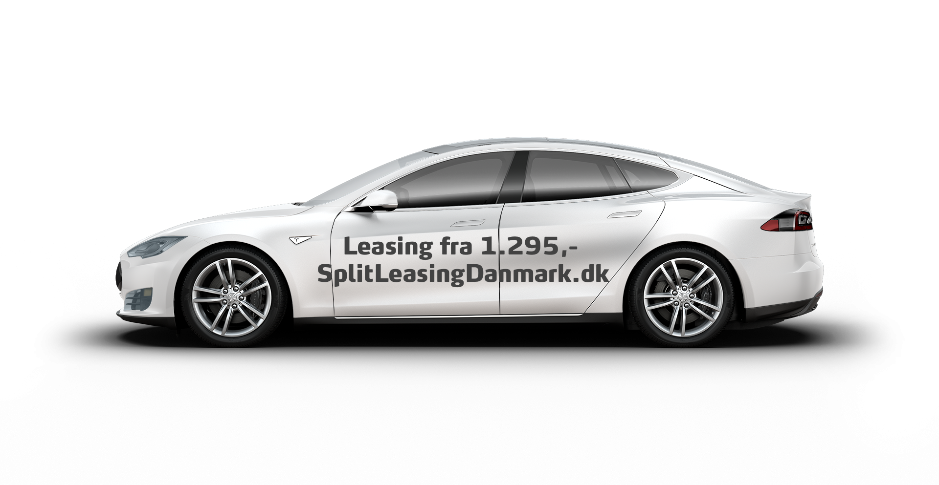
My first Logo and its use on many cargo trucks in Copenhagen.
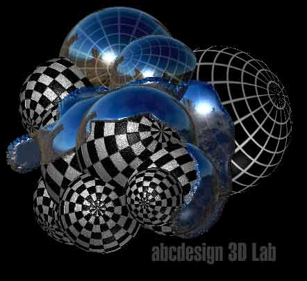
3D BY MICHAEL.DK
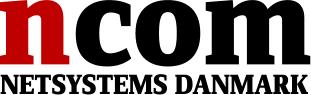
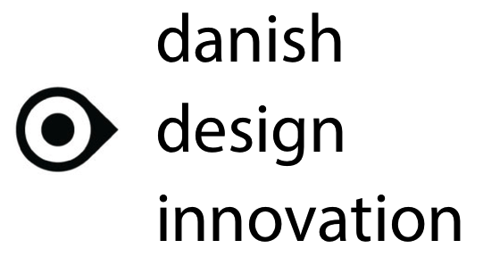
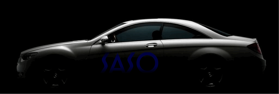
Their Corporate Logo Design for the company in all scandinavian countries
The simple logo for SONG


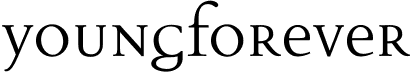
Logo Design with a newsletter vignette for an Art website

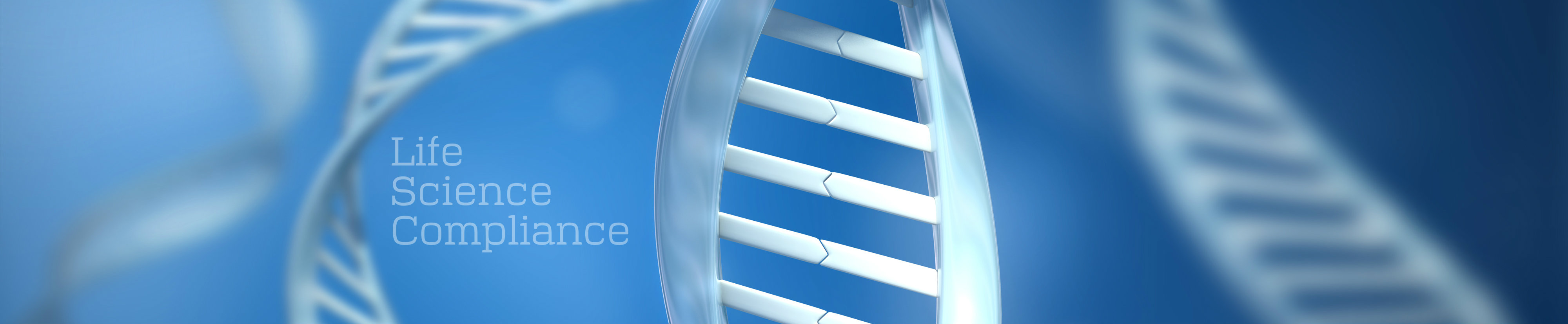
A word trademark for the life science industry
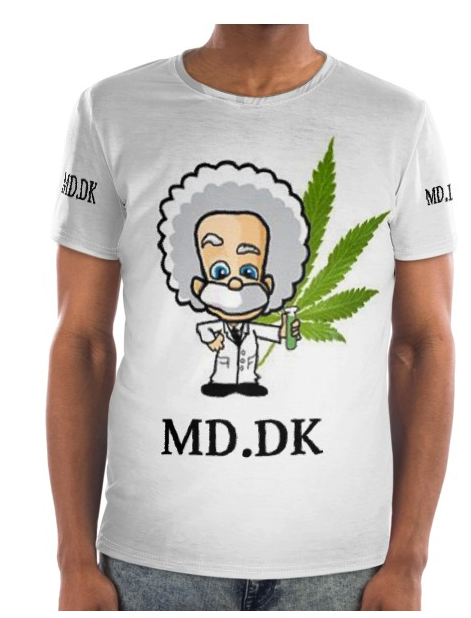
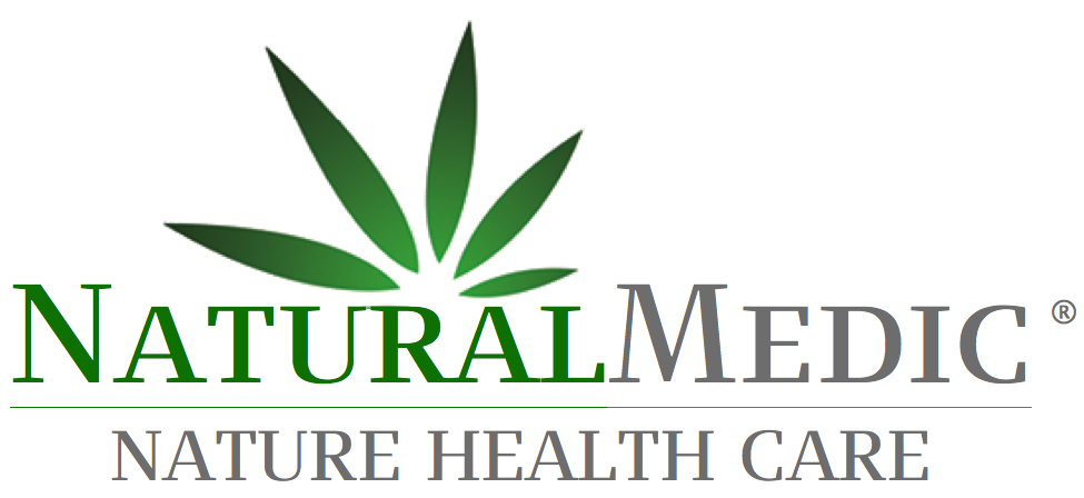
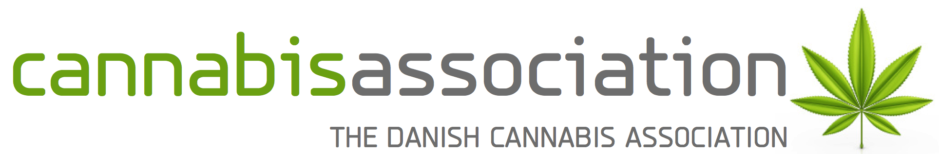
2 Logoer som blev udvalgt til at repræsenterer Cannabis Olie
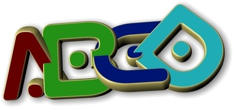
Det originale logo til reklamebureaet abcdesign


VITABELLE
Call +45 32177777 for a perfect Logo Design
Prices are from 1.000,-